Top-Down Analysis.
📊 1. What Each Trend Shows
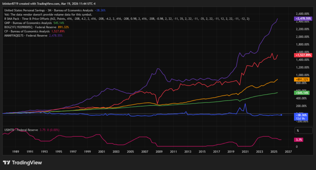
Below is a breakdown of the indicators plotted and what their long‑term movements mean.
🟦 1. Personal Savings (Blue) — Slight Decline (‑4.65%)
Trend:
Personal savings have not kept up with the growth of the economy or prices. After the COVID spike in 2020, savings collapsed sharply.
What it means:
- Households are saving less relative to income.
- Consumption is strong, but financial resilience is weakening.
- Inflation and higher living costs have eaten into disposable income.
This is a sign of household stress, not strength.
🟩 2. GNP (Green) — Strong Growth (+202.66%)
Trend:
Gross National Product has more than tripled since 2001.
What it means:
- The U.S. economy has expanded steadily over 25 years.
- Productivity, population, and corporate output have grown.
- Long‑term economic fundamentals remain strong.
This is the “healthy” part of the picture.
🟧 3. BGDG1FL192090005Q (Orange) — +311.20%
This is a Federal Reserve Flow‑of‑Funds series. Based on the code, it likely represents business savings, retained earnings, or financial assets.
Trend:
Business financial assets have grown faster than GNP.
What it means:
- Corporations have accumulated large cash reserves.
- Businesses are saving more than households.
- Corporate balance sheets are strong, even when households struggle.
This is a sign of corporate financial power.
🟥 4. Consumer Prices (Red) — Massive Increase (+542.09%)
Trend:
Prices have risen more than fivefold since 2001 — the steepest line on your chart.
What it means:
- Inflation has dramatically eroded purchasing power.
- Wages have not kept up with prices for many households.
- This explains why personal savings are falling.
This is the core pressure point in the economy.
🟪 5. MMWFAFA027S (Purple) — +368.81%
This is another Federal Reserve series, likely tied to money market fund assets or financial sector wealth.
Trend:
Financial assets have grown much faster than personal savings.
What it means:
- Wealth accumulation is concentrated in financial markets.
- Institutional investors (pensions, funds, corporations) are growing faster than households.
- The financial system is flush with liquidity.
This shows financialization of the economy.
🟫 6. Interest Rates (Brown) — 3.75%
Trend:
Rates fell for 15 years, hit zero, then spiked after 2021.
What it means:
- Cheap money fueled asset growth (stocks, real estate, corporate savings).
- The recent rate spike is a response to the inflation surge.
- Higher rates now pressure households and businesses differently.
This is the policy response to inflation.
🧠 2. What the Combined Picture Says About the U.S. Economy
Your chart tells a very coherent story — and it’s one economists talk about often.
🟩 A. The Economy Grew Strongly (GNP ↑)
Output, production, and corporate profits expanded steadily.
This is the backbone of long‑term economic strength.
🟥 B. Inflation Exploded (CPI ↑ 542%)
Prices rose far faster than incomes or savings.
This is the biggest distortion in your chart.
🟦 C. Households Fell Behind (Savings ↓)
Personal savings did not keep pace with inflation or economic growth.
This signals:
- Higher cost of living
- Lower financial security
- Rising reliance on debt
🟧 D. Corporations and Financial Institutions Pulled Ahead (Assets ↑ 300–400%)
Corporate and financial sector assets grew much faster than household savings.
This shows:
- Wealth concentration
- Strong corporate balance sheets
- A financial system that benefits from low rates and asset inflation
🟫 E. Interest Rates Tell the Story of Two Eras
- 2001–2021: Falling rates → cheap money → asset boom
- 2022–2024: Rising rates → inflation fight → household pressure
🧩 3. The Big Picture: What This Means for the U.S. Economy
1. The U.S. economy is strong at the macro level (GNP, corporate assets).
Growth, innovation, and corporate profitability remain robust.
2. Inflation has been the dominant force reshaping everything.
It explains:
- Falling personal savings
- Rising corporate cash
- Higher interest rates
- Wealth inequality
3. Households are the weak link.
Savings are down, costs are up, and debt is rising.
4. Corporations and financial institutions are the winners.
Their assets have grown dramatically, benefiting from:
- Low interest rates
- Asset inflation
- Global capital flows
5. The economy is becoming more financialized.
More wealth is held in financial markets, not in household bank accounts.
⚠️ Stock Trading Disclaimer
The information provided is for educational and informational purposes only and should not be interpreted as financial advice, investment advice, or a recommendation to buy or sell any securities. Trading and investing in the stock market involve significant risk, including the potential loss of principal. Past performance is not indicative of future results.
Always conduct your own research or consult with a licensed financial professional before making any investment decisions. You are solely responsible for evaluating the risks associated with trading and for any decisions you make based on the information provided.