- Date + Trading Day Number
April 18, 2026 No trades today Its Saturday - Hours Worked
started musing about 10:00 am really woke up with ideas at 3:00 but didn’t want to wake Robyne. - Markets Analyzed
Looking into more GUSH analysis and how to analyze Contango and Backwardation - Trades Taken
- No Trades today
- Charts or Screenshots
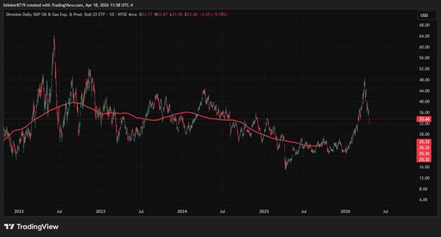
The above is a daily chart of GUSH. The red line is a Centered Moving average for 264 days. It is Offset by -132 days. This covers a little more than a year of trading Days.The channel is formed by taking the total sample size and containing its magnitude in a Channel Boundary.
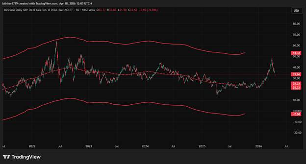
Have I mentioned that Trading View is absolutely INCREDIBLE! Well it is. This is a curvilinear confidence interval. The channel boundaries contain all the data.
The dotted lines are derived from taking the magnitude of the outer boundaries and calculating the inner boundaries as if the outer were 3 standard deviations. The inner boundaries are set for 50% ish.
Note that where price moves outside of the inner boundaries that is moves back into the inner boundaries. The opposite is also true.
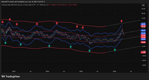
Due to the centering of the Moving Average the last bits of channel boundaries are cut off. The same goes for the beginning of the channel. Using the Pitchfork tool a quick linear extrapolation of the rest of the channel is drawn.
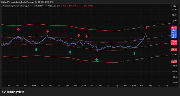
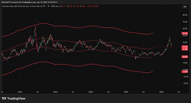
After the Yearly outer channel is calculated I want to see how the monthly Time series is moving inside of it. The blue line is a centered moving average for 22 trading days. This is representative of a month of trading.
The peaks and troughs of the Monthly channel correspond to movement of price outside of the inner channel of the Yearly channel.
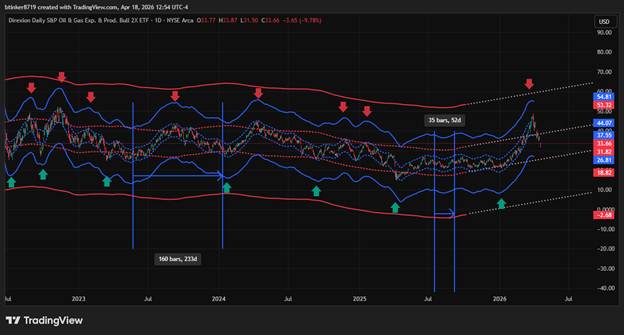
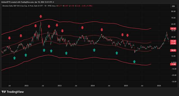
Using the same idea of channelization focusing on duration instead of magnitude, a modified Gann box can be drawn. This is used to scan for Pulse Cycles. I’m calling a pulse cycle the excursions of price when it moves outside of the inner channel from either the high or low and back to below or above when it started. For example, when price moves from a green arrow to a red and back to a green arrow. The same is true for Red to Green and back to Red.
The longest pulse and the shortest pulse are used to modify the Gann box.
When the box is aligned it shows a bracket of expectation. The two Green lines border where price has the best possibly of travel in both time and magnitude. This is for the blue channel, which pulses up and down within the outer channel.
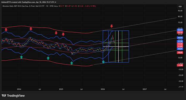
The vertical white line is the average distance between the longest and shortest peak and trough of the blue channel. The green lines are a rough estimate of the first standard deviation. The horizontal line are spaced the same way but use magnitude.
The left edge of the box is aligned with the green arrow. The box shows that this is likely close to a reversal.
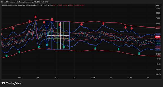
Below is the output of an FFT done for GUSH. The arrow point to the Inverse of the frequency values that were most prominent. Those values were used to make the modified Gann box that is all white.
The symmetry is always fascinating to me.
- End‑of‑Day Review
- What worked. The Time spectrum of Gush corresponds to the Manually calculated box.
- What didn’t. It all worked
- Adjustments for tomorrow explain more about the relationship between time and magnitude and how the Gann boxes show the boundaries and point to horizontal lines of support and
- This content is for educational purposes only and is not financial, investment, or trading advice. Trading involves significant risk and may result in the loss of your capital. Nothing here should be interpreted as a recommendation to buy or sell any financial instrument. You are solely responsible for your trading decisions. Always do your own research